authors are vetted experts in their fields and write on topics in which they have demonstrated experience. All of our content is peer reviewed and validated by Toptal experts in the same field.
Bharat is a data scientist and developer who specializes in designing and developing interactive reports and tools to facilitate decision-making. He has worked with small startups and large corporations, such as Comcast, MetLife, UnitedHealth Group/Optum, and Jefferson Health. One of Bharat’s projects delivered $6 million in revenue, and another delivered $10 million in savings.
Social network analysis is quickly becoming an important tool to serve a variety of professional needs. It can inform corporate goals such as targeted marketing and identify security or reputational risks. Social network analysis can also help businesses meet internal goals: It provides insight into employee behaviors and the relationships among different parts of a company.
Organizations can employ a number of software solutions for social network analysis; each has its pros and cons, and is suited for different purposes. This article focuses on Microsoft’s Power BI, one of the most commonly used data visualization tools today. While Power BI offers many social network add-ons, we’ll explore custom visuals in R to create more compelling and flexible results.
This tutorial assumes an understanding of basic graph theory, particularly directed graphs. Also, later steps are best suited for Power BI Desktop, which is only available on Windows. Readers may use the Power BI browser on Mac OS or Linux, but the Power BI browser does not support certain features, such as importing an Excel workbook.
Structuring Data for Visualization
Creating social networks starts with the collection of connections (edge) data. Connections data contains two primary fields: the source node and the target node—the nodes at either end of the edge. Beyond these nodes, we can collect data to produce more comprehensive visual insights, typically represented as node or edge properties:
1) Node properties
Shape or color: Indicates the type of user, e.g., the user's location/country
Size: Indicates the importance in the network, e.g., the user's number of followers
Image: Operates as an individual identifier, e.g., a user's avatar
2) Edge properties
Color, stroke, or arrowhead connection: Indicates type of connection, e.g., the sentiment of the post or tweet connecting the two users
Width: Indicates strength of connection, e.g., how many mentions or retweets are observed between two users in a given period
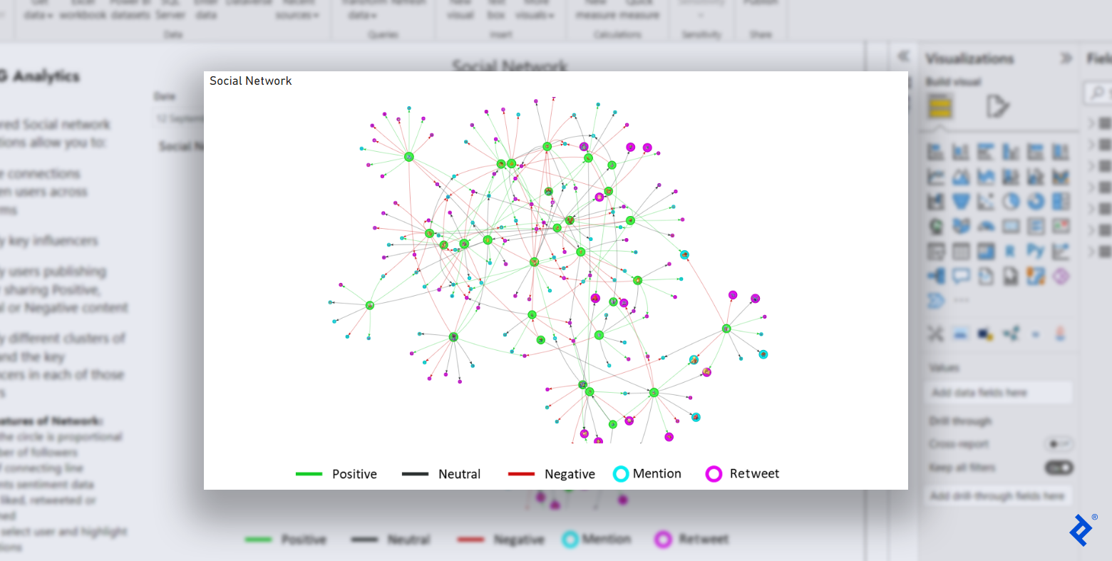
Let’s inspect an example social network visual to see how these properties function:
Green, light blue, and dark blue nodes and varying circle or diamond shapes demonstrate different node types. Numbers with transparent backgrounds act as the node image identifiers, and larger nodes (such as Node 4) are more important in the network. Different edge types are indicated by color (green, blue, or gray), stroke (solid or dotted), and arrowheads (empty or filled); edge width shows strength (for example, the connection from Node 8 to Node 9 is strong).
We can also use hover text to supplement or replace the above parameters, as it can support other information that cannot be easily expressed through node or edge properties.
Comparing Power BI’s Social Network Extensions
Having defined the different data features of a social network, let’s examine the pros and cons of four popular tools used to visualize networks in Power BI.
Extension
Social Network Graph by Arthur Graus
Network Navigator
Advanced Networks by ZoomCharts (Light Edition)
Custom Visualizations Using R
Dynamic node size
Yes
Yes
Yes
Yes
Dynamic edge size
No
Yes
No
Yes
Node color customization
Yes
Yes
No
Yes
Complex social network processing
No
Yes
Yes
Yes
Profile images for nodes
Yes
No
No
Yes
Adjustable zoom
No
Yes
Yes
Yes
Top N connections filtering
No
No
No
Yes
Custom information on hover
No
No
No
Yes
Edge color customization
No
No
No
Yes
Other advanced features
No
No
No
Yes
Social Network Graph by Arthur Graus, Network Navigator, and Advanced Networks by ZoomCharts (Light Edition) are all suitable extensions to develop simple social networks and get started with your first social network analysis.
An example visualization made using the Social Network Graph by Arthur Graus extension.
An example visualization made using the Network Navigator extension.
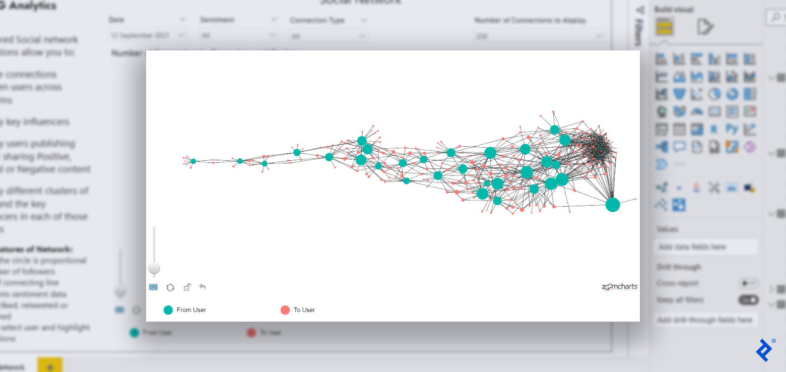
An example visualization made using the Advanced Networks by ZoomCharts (Light Edition) extension.
However, if you want to make your data come alive and uncover groundbreaking insights with attention-grabbing visuals, or if your social network is particularly complex, I recommend developing your custom visuals in R.
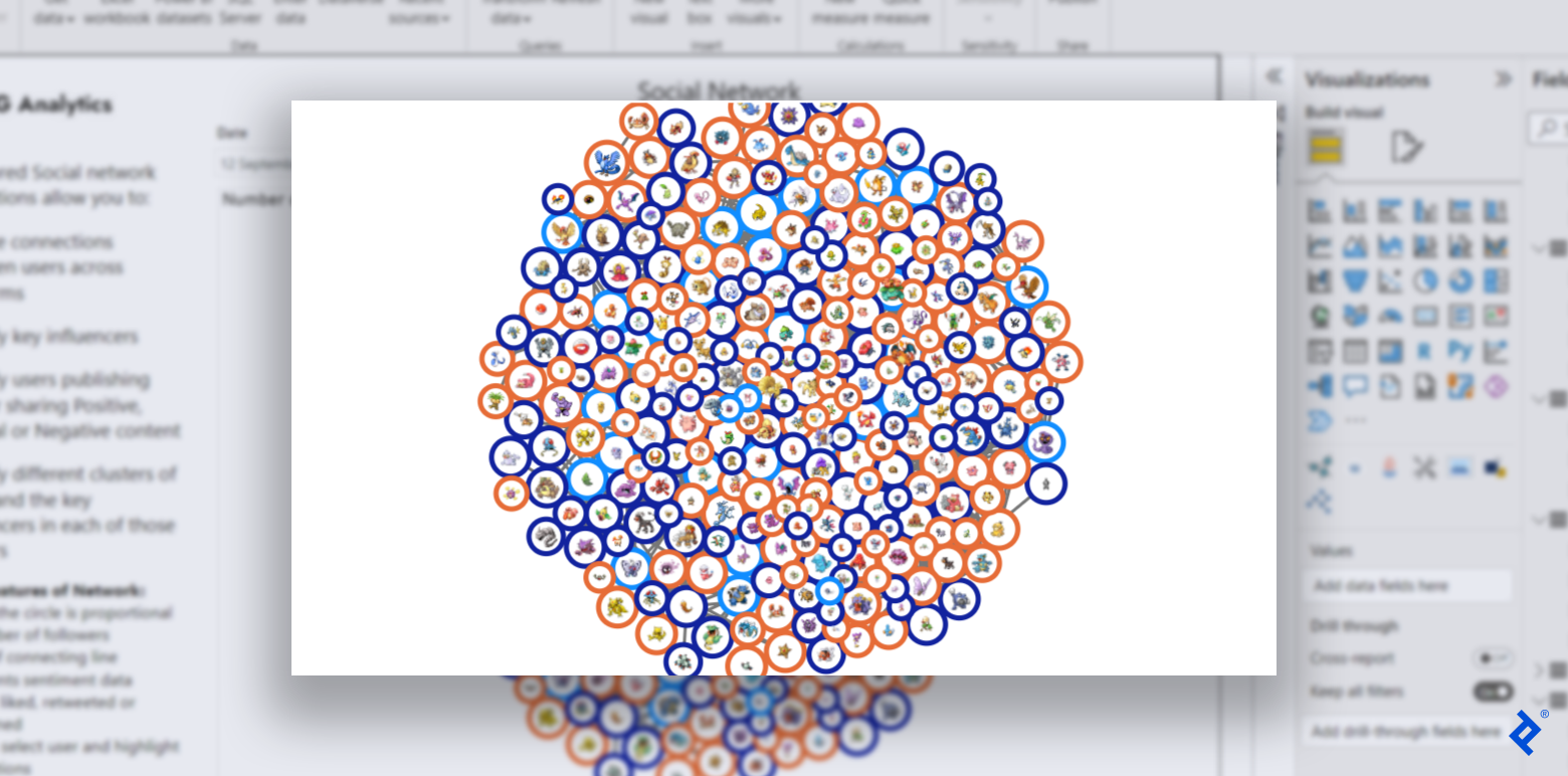
An example visualization made using custom visuals in R.
This custom visualization is the final result of our tutorial’s social network extension in R and demonstrates the large variety of features and node/edge properties offered by R.
Building a Social Network Extension for Power BI Using R
Creating an extension to visualize social networks in Power BI using R comprises five distinct steps. But before we can build our social network extension, we must load our data into Power BI.
Prerequisite: Collect and Prepare Data for Power BI
You can follow this tutorial with a test dataset based on Twitter and Facebook data or proceed with your own social network. Our data has been randomized; you may download real Twitter data if desired. After you collect the required data, add it into Power BI (for example, by importing an Excel workbook or adding data manually). Your result should look similar to the following table:
Once you have your data set up, you are ready to create a custom visualization.
Step 1: Set Up the Visualization Template
Developing a Power BI visualization is not simple—even basic visuals require thousands of files. Fortunately, Microsoft offers a library called pbiviz, which provides the required infrastructure-supporting files with only a few lines of code. The pbiviz library will also repackage all of our final files into a .pbiviz file that we can load directly into Power BI as a visualization.
The simplest way to install pbiviz is with Node.js. Once pbiviz is installed, we need to initialize our custom R visual via our machine’s command-line interface:
pbiviz new toptalSocialNetworkByBharatGarg -t rhtml
cd toptalSocialNetworkByBharatGarg
npm install
pbiviz package
Don’t forget to replace toptalSocialNetworkByBharatGarg with the desired name for your visualization. -t rhtml informs the pbiviz package that it should create a template to develop R-based HTML visualizations. You will see errors because we have not yet specified fields such as the author’s name and email in our package, but we will resolve these later in the tutorial. If the pbiviz script won’t run at all in PowerShell, you first may need to allow scripts with Set-ExecutionPolicy RemoteSigned.
On successful execution of the code, you will see a folder with the following structure:
Once we have the folder structure ready, we can write the R code for our custom visualization.
Step 2: Code the Visualization in R
The directory created in the first step contains a file named script.r, which consists of default code. (The default code creates a simple Power BI extension, which uses the iris sample database available in R to plot a histogram of Petal.Length by Petal.Species.) We will update the code but retain its default structure, including its commented sections.
Next, we will replace the code in the Actual code section with our R code. Before creating our visualization, we must first read and process our data. We will take two inputs from Power BI:
num_records: The numeric input N, such that we will select only the top N connections from our network (to limit the number of connections displayed)
dataset: Our social network nodes and edges
To calculate the N connections that we will plot, we need to aggregate the num_records value because Power BI will provide a vector by default instead of a single numeric value. An aggregation function like max achieves this goal:
limit_connection <- max(num_records)
We will now read dataset as a data.table object with custom columns. We sort the dataset by value in decreasing order to place the most frequent connections at the top of the table. This ensures that we choose the most important records to plot when we limit our connections with num_records:
Next, we must prepare our user information by creating and allocating unique user IDs (uid) to each user, storing these in a new table. We also calculate the total number of users and store that information in a separate variable called num_nodes:
Next, we create node and edge data frames for the visualization. We choose the style and shape of our nodes (filled circles), and select the correct columns of our user_ids table to populate our nodes’ color, data, value, and image attributes:
nodes <- create_node_df(n = num_nodes,
type = "lower",
style = "filled",
color = user_ids$col_type,
shape = 'circularImage',
data = user_ids$uid,
value = user_ids$size,
image = user_ids$avatar,
title = paste0("
Similarly, we pick the dataset table columns that correspond to our edges’ from, to, and color attributes:
edges <- create_edge_df(from = dataset$uid,
                        to = dataset$uid_retweet,
                        arrows = "to",
                        color = dataset$col_sentiment)
Finally, with the node and edge data frames ready, let’s create our visualization using the visNetwork library and store it in a variable the default code will use later, called p:
Here, we customize a few network visualization configurations in visOptions and visPhysics. Feel free to look through the documentation pages and update these options as desired. Our Actual code section is now complete, and we should update the Create and save widget section by removing the line p = ggplotly(g); since we coded our own visualization variable, p.
Step 3: Prepare the Visualization for Power BI
Now that we have finished coding in R, we must make certain changes in our supporting JSON files to prepare the visualization for use in Power BI.
Let’s start with the capabilities.json file. It includes most of the information you see in the Visualizations tab for a visual, such as our extension’s data sources and other settings. First, we need to update dataRoles and replace the existing value with new data roles for our dataset and num_records inputs:
# ...
  "dataRoles": [
    {
      "displayName": "dataset",
      "description": "Connection Details - From, To, # of Connections, Sentiment Color, To Node Type Color",
      "kind": "GroupingOrMeasure",
      "name": "dataset"
    },
    {
      "displayName": "num_records",
      "description": "number of records to keep",
      "kind": "Measure",
      "name": "num_records"
    }
  ],
# ...
In our capabilities.json file, let’s also update the dataViewMappings section. We’ll add conditions that our inputs must adhere to, as well as update the scriptResult to match our new data roles and their conditions. See the conditions section, along with the select section under scriptResult, for changes:
Let’s move on to our dependencies.json file. Here, we will add three additional packages under cranPackages so that Power BI can identify and install the required libraries:
Lastly, let’s add relevant information for our visual to the pbiviz.json file. I’d recommend updating the following fields:
The visual’s description field
The visual’s support URL
The visual’s GitHub URL
The author’s name
The author’s email
Now, our files have been updated, and we must repackage the visualization from the command line:
pbiviz package
On successful execution of the code, a .pbiviz file should be created in the dist directory. The entire code covered in this tutorial can be viewed on GitHub.
Step 4: Import the Visualization Into Power BI
To import your new visualization in Power BI, open your Power BI report (either one for existing data or one created during our Prerequisite step with test data) and navigate to the Visualizations tab. Click the … [more options] button and select Import a visual from a file. Note: You may need to first select Edit in a browser in order for the Visualizations tab to be visible.
Navigate to the dist directory of your visualization folder and select the .pbiviz file to seamlessly load your visual into Power BI.
Step 5: Create the Visualization in Power BI
The visualization that you imported is now available in the visualizations pane. Click on the visualization icon to add it to your report, and then add relevant columns to the dataset and num_records inputs:
You can add additional text, filters, and features to your visualization depending on your project requirements. I also recommend that you go through the detailed documentation for the three R libraries we used to further enhance your visualizations, since our example project cannot cover all use cases of the available functions.
Upgrading Your Next Social Network Analysis
Our final result is a testament to the power and efficiency of R when it comes to creating custom Power BI visualizations. Try out social network analysis using custom visuals in R on your next dataset, and make smarter decisions with comprehensive data insights.
The Toptal Engineering Blog extends its gratitude to Leandro Roser for reviewing the code samples presented in this article.
Power BI helps you create dashboards with interactive data visualizations that can be used to monitor real-time metrics, analyze data, and make business decisions.
Is Power BI difficult to learn?
Power BI is not difficult to learn, especially if you have experience with other data visualization tools. The UI is intuitive and there are plenty of online resources to help you get started. However, there is a learning curve involved in mastering all Power BI features and capabilities.
Why is social network analysis important?
Social network analysis can be used to understand the relationships between individuals within a group. This information can be used to perform targeted marketing and outreach efforts, study the spread of information, and understand the structure of the social network.
What are the basic steps in social network analysis?
First, choose a social network to analyze. Then, define what constitutes a connection between two individuals. Next, identify all individuals in the social network. Then, identify all of the connections between individuals. Finally, analyze the connections to find patterns or trends.
What is visualization in social network analysis?
Visualization in social network analysis is the process of mapping out relationships and patterns in data in order to better understand the underlying structure of a social system. This can be done using a variety of methods, including social network diagrams, node-link diagrams, and matrices.
Can you use R with Power BI?
Yes, you can create custom visuals in Power BI using R code. Microsoft’s pvibiz library simplifies the process by providing the required infrastructure with just a few lines of code.
Bharat is a data scientist and developer who specializes in designing and developing interactive reports and tools to facilitate decision-making. He has worked with small startups and large corporations, such as Comcast, MetLife, UnitedHealth Group/Optum, and Jefferson Health. One of Bharat’s projects delivered $6 million in revenue, and another delivered $10 million in savings.
authors are vetted experts in their fields and write on topics in which they have demonstrated experience. All of our content is peer reviewed and validated by Toptal experts in the same field.